Mastering Website Design with a Website Builder – Tips and Best Practices

Web design is a very important part of any site because you have a compilation of text and photos without it. And by investing in this, you’ll get your site visitors to stay longer on any page.
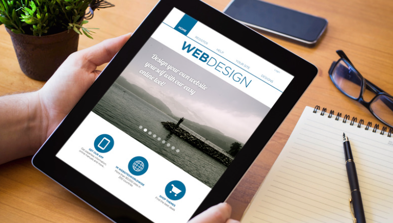
Fortunately, you don’t have to learn how to code (it takes too long!) or outsource web design services (it’s too expensive!) to create beautiful and responsive pages. With a personal and responsive website builder from a reputable provider, you can make one in just minutes. Select a template, colors, themes, and font, populate your pages with content, and publish!
Also, remember these tips and best practices as you put your artistry to the test and design your first site with a website builder.
Don’t Be Afraid to Use Templates
A responsive website builder usually offers templates as part of its services. Despite this, a lot of web owners still don’t want to use them because they don’t want anyone to see the web pages as generic. But templates are popular because they work.
Besides, you don’t need to use them as they are. Think of a template as a starting point instead of the final output. You can still incorporate your creativity by changing colors, adding or removing graphic elements, and, most importantly, creating top-notch content.
Look at the Designs of Others
Particularly see if any patterns emerge. What colors and fonts do they tend to use? How about graphical elements?
Remember that nothing exists in a vacuum. To some degree, you have to conform to what’s acceptable in your industry.
But aesthetic standards often aren’t formally established. Everyone has certain expectations of how certain types of businesses should present themselves. For example, a law firm is something seen as serious, so cute graphics may not be the best option.
Analyze How It Would Appear on a Mobile Device
Can we guess where you’re reading this article right now? You’re probably on your phone, just scrolling until you eventually get to the end of the post.
Even if we got it wrong, statistics are on our side because 55% of organic traffic now comes from mobile devices. Therefore, you should assume that a significant portion of your traffic will be coming from there.
Neglecting this segment of your audience can have some impact on how long visitors stay on the page they land on. Plus, mobile optimization matters to SEO, so you have more incentive to pay as much attention to it as you do on the desktop version.
Think About What Will Attract Your Visitors
Design is very powerful. Apart from improving the aesthetic experience of your virtual visitors, it can help you draw their attention to some texts or images more than others.
You can do this by increasing the text size if it’s something that you want them to read. Or, if you want them to click on a button, you can make it stand out from the surrounding text and graphics by increasing its size and giving it a more prominent color.
Basically, you want to create their journey as they navigate your pages. Use design to influence where their eyes go.
Remember That Content Is Important Too

What a page looks like and what message it contains need to complement each other. So, if we’re going to leave just one website design guide, it’s to create the design based on the content and not the other way around.
Think about when you’re buying a pair of shoes. You don’t get them three sizes too big or too small because they may look awkward on your feet and be uncomfortable to boot. In the same way, page aesthetics should complement the content.
Have a Neutral Third-Party See Your Work
Even if you did your best on any visual output, it can be hard to make critiques. Getting fresh eyes on the project is a great way to see where else you can improve while building a website.
Of course, there’s always the argument that aesthetics are subjective. Even if you see it from this point of view, remember that the only opinion that matters is that of your audience. So, consider the third party as your practice audience.
You Can Build Beautiful and Responsive Websites in Minutes, But Don’t Rush!
With all the features a great website builder has, you can design and publish yours in just a few minutes. But this doesn’t mean you should. You still need to put a lot of thought into the elements you’ll introduce.
If you’re feeling stuck, follow our guide to web design, and you’ll be on the right path. We hope our tips help you find artistic inspiration and bring the results that you want from your website. Have fun creating!
Author Profile

- Blogger by Passion | Contributor to many Business and Marketing Blogs in the United Kingdom | Fascinated with SEO and digital marketing and latest tech innovations |
Latest entries
 Online BusinessNovember 19, 2025Does Automated Data Drive Growth?
 TechnologyNovember 18, 2025How AI Social Media Tools Use Mobile Proxies to Avoid Detection?
 TechnologySeptember 26, 2025Make Review Videos Pop with Interactive AI Avatar Additions
 TechnologySeptember 5, 2025How Beginners Can Choose a Safe and Trusted Platform for Playing Online Games?