10 Useful Tips To Make Your Email Newsletter Attractive
How do I make a good email newsletter
Email marketing is one of the most efficient ways that businesses content marketing can use to reach their clients, build their reputation, and even develop their customer base. Besides, managing email campaigns is more manageable than many individuals imagine. According to statistics, 40% of business to business marketers say that email newsletters are vital to the success of their content marketing efforts, and 73 percent of millennials usually prefer having their small business website communications through email.
Furthermore, 99 percent of consumers typically check their email and social media accounts every day, and it’s by far the favorite way to get updates from different brands. As a marketer, you cannot ignore these statistics. That is why it is essential to create a good email marketing plan and an attractive email newsletter. Here are some useful tips and tricks that you can implement to make your email newsletter more appealing to boost your email marketing strategy.
-
Create an outstanding header

One of the most important parts of a newsletter is the header. Headers act as your brand’s identity, and your customers can recognize your brand more easily through it. Your header should be at the top part of the newsletter and must include your company’s name, your business online logo, and the title of the newsletter. Many free online tools can assist you in creating alluring headers for your email newsletters, and you don’t have any experience in graphic design to use them. However, if you don’t know how to create headers, you can consider hiring professional website speed builders, you can find more info about them here, to create appealing header designs for your email newsletter.
-
Allow your logo to dictate the color scheme

Your email newsletter requires a color scheme. Since your brand logo is a significant part of the header, you can consider utilizing its colors throughout your newsletter as borders, font colors, and any other element. Besides, your logo’s colors should make up the color scheme for your branding in its entirety.
-
Use subheadings

If you would like to arrange many pieces of content, then subtitles are vital. Subheadings can work wonders because they will give your readers a feeling that they are reading their morning newspaper. Subheadings assist marketers a lot when it comes to displaying information cohesively. Utilize clear fonts for all the subtitles and also make their size smaller than that of the header. Nonetheless, your subheading texts’ font size should be a bit bigger than the size you utilize for all your blog posts.
-
Use pictures

To have a well-designed email, you need to have a good balance of images and texts. When a reader opens your email, pictures immediately grab their attention. Including a few pictures of your company or products will attract your email recipients while boosting the effectiveness of your brand’s message too. When creating your next email newsletter, include images that are easy to capture using your digital camera. Take a shot of your latest product, for instance, or a company employee’s photo that you would like to highlight or include in your next edition.
-
Use short and nice texts
When creating an email newsletter, you need to avoid using long sentences and long paragraphs. Since individuals’ attention span is slowly waning with time, it would be best not to feed them with long paragraphs and big texts. Furthermore, most of your email newsletters should be targeted to the top management officials of an organization. These people have limited time to go through lengthy paragraphs due to their busy schedules. Therefore, short, sweet, and effective texts are ideal for your next edition of the email newsletter.
Many email newsletters received by directors of companies are either deleted or sent to the trash folder. To prevent that from happening to your newsletters, ensure you give them value. Try to offer some variety in all the topics you plan to cover. You can use a CRM platform to analyze the preferences of every customer you have to help you send them different topics that will interest them.
-
Use standard fonts
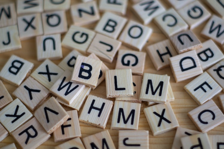
One of the most important things you need to do when choosing fonts for your email newsletter is to check their legibility. Stick to the standard font types such as Arial, Helvetica, Calibri, Times New Roman, and Cambria. Also, avoid using too many font types in one email newsletter because it will only give you a disorganized and cluttered impression that might easily distract your readers. You can select one or two fonts for the entire newsletter and stick to them in every email newsletter you create for your brand.
-
Use white space wisely

Using white spaces when designing your newsletter can be a great idea because it allows your design to breathe sometimes. The smart and deliberate use of some white spaces in your newsletter design makes it easy for the readers to digest any information. That’s because the human brain can easily and quickly scan, break, and interpret texts whey they are arranged strategically using white spaces.
-
Have an organized and clean layout
To maintain your readers’ attention from the beginning to the end of your newsletter, you need to have an organized and clean layout that is pretty easy to create. Complicated designs will only distract your readers and make the newsletter overwhelming. You can check the email newsletter templates available online to have an idea about the required and correct size of email newsletters. Start by creating a rough newsletter layout for yourself before including the necessary graphics and contents.
-
Make sure the clickable elements are noticeable

Ensure all the clickable items you include in your email newsletter are easily noticeable. If these elements are blended or hidden within the design, your readers might miss them out. In this modern era, clicks are the current currency of the web, and you cannot afford to miss a single click. Pick a color scheme that makes all your clickable elements easy to recognize.
-
Use a responsive design
Mobile technology is usually common in internet surfing compared to desktops. Nowadays, almost half of the sent emails are opened and even viewed on smartphones. According to research carried out by Yesmail, the proportions of mobile email clicks rose by 10 percent between 2014 and 2015, with mobile representing 45 percent of all email clicks currently. These statistics indicate how important it is to optimize your email newsletters for mobile gadgets to avoid losing clicks.
Conclusion
When you are creating email newsletters, you need to remember that you want it to grab your readers’ attention. A clean and well-organized layout is one of the best ways to ensure your readers digest your newsletter content easily and quickly. After all, it’s all about creating a great experience for your readers and making their path to conversion, a smooth and easy journey. Try these ten proven tips to spice up your email newsletters every time you plan for an email marketing campaign. Creatively designed newsletters will increase readability and also make your audience look forward to receiving the next edition.
Author Profile
- Senior SEO Consultant and Blogger Outreach Expert at ClickDo Ltd. Also, I help Business Owners in the UK by flooding more Leads to their Business through Google Ads, Facebook Ads & Remarketing. Author in many premium UK blogs.
Latest entries
 Web HostingNovember 15, 2024Top Free and Low-Cost Tools for Managing Cost-Effective Dedicated Hosting
 TechnologyNovember 12, 2024Building a Secure Website: Why DNS Security Matters for Every Business?
 TechnologyNovember 9, 2024How Can AI Benefit Small Business Operations?
 Digital MarketingOctober 29, 2024Digital Marketing Strategies for New Online Stores

