How to improve your website’s user experience?

In the SEO world, every website owner should be aware of the basics of website designs and white hat SEO to improve the website’s user experience. To design a great website and to improve the user experience for your website, you should understand the problems and views of different visitors.
While building a website or redesigning a website, the website owners need to raise the following questions themselves about their own websites,
- What are useful features are there to find on the website?
- Whether the content is useful to read?
- If you were the visitor, how long you would like to ped time on your website?
- Do your pages have too many distractions?
- Are the menu and navigational features being in the desired way?
These questions will help to improve their website to get the best UX. Some website owners do not have enough time to look back at their website and make it more responsible for greater UX. To overcome this, we have collected a list of 8 simple ways to improve your website’s user experience.
Top 8 tips to improve your website’s user experience
Your website is the core Factor for all your digital marketing efforts. Designing a great website with a great user experience requires understanding the problems of different visitors from a different angle.
1. Include more white space
Having a website with more white space is a good design for the user experience. White spaces make your page more legible and highlight’s your content that makes your user get to focus on the elements on the webpage.
White paces around the website titles and texts increase the user attention by 30 % and also the white space makes your website fresh, stylish, and brand-focused.
Consider the website, www.fernandoraymond.com, by Fernando Raymond. He used a lot of white space from the start to pulling his user’s attention to focus on the important things in his website. This allows users to easily read the content and also allows the search engines to easily crawl the webpage that works better on SEO ranking.
2. Focus on your Page Speed
Waiting for a website to load for a long time make is the most frustrating thing. This gives negative experiences to users. Nowadays, all are using mobile devices to access websites on the Internet. They are expecting a fast result for the content that they browse without any delay. Slowly loading pages interrupt the user experience and reduce the growth of the website. Images have a high impact on the page speed, so to improve the page speed add the images after compressing them and it reduce your website’s bounce rate.
Use Google’s Page speed insight tool to analyze the page speed of your website.
3. Use an attractive call to action button
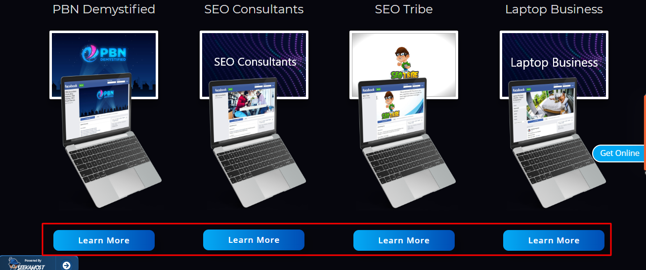
Make your Call to action with actionable and accustomed words, to enable the website navigation easier for your website users. While creating call-to-action buttons for your website, you should understand the color’s psychology and check the familiar websites to know how they increase their clicks through the CTA buttons and choose the color and patterns wisely for the CTA buttons.
Not only does the color matter, but also choose the right words that trigger the users.
For Example: “Sign- Up Now” “ Get started “ “Learn More” Click Here”
4. Differentiate hyperlinks
When you are adding a link in your website, make sure the links are easily identified by your users to click through. The underlined text draws the attention of the users and lets them a link on the link.
The standard pattern is blue-colored underlined text.
5. Use attractive images
Use the images wisely for a greater user experience. Avoid using more stock images, to increase the personalized look of your website. Using stock photos that may be available on other’s websites across the internet can decrease the trust value and uniqueness. So, to increase the user experience and conversion, replace the stock photos with an actual image of your business products, or team members, client place photos, etc. This helps to increase the confidence among the users.
6. Concentrate more on Headlines
Next to the images, your headlines are more important than brings more potential customers to your website . Include keywords in your title and make it clear to attract the right audience.
Search engines give more weightage to the headings over the content, so choosing the right heading tag improves the search ranking. Make your headings stand out in a formatted size and color and make them more brandable.
7. Keep your content simple
Make your content unique and simple to make your user easily understand, what you are trying to convey to them. Enable the page navigation and fix the right content. Only quality content brings your website to the top level of SERP. Regularly update the content and make your website more active.
8. Mobile-friendly
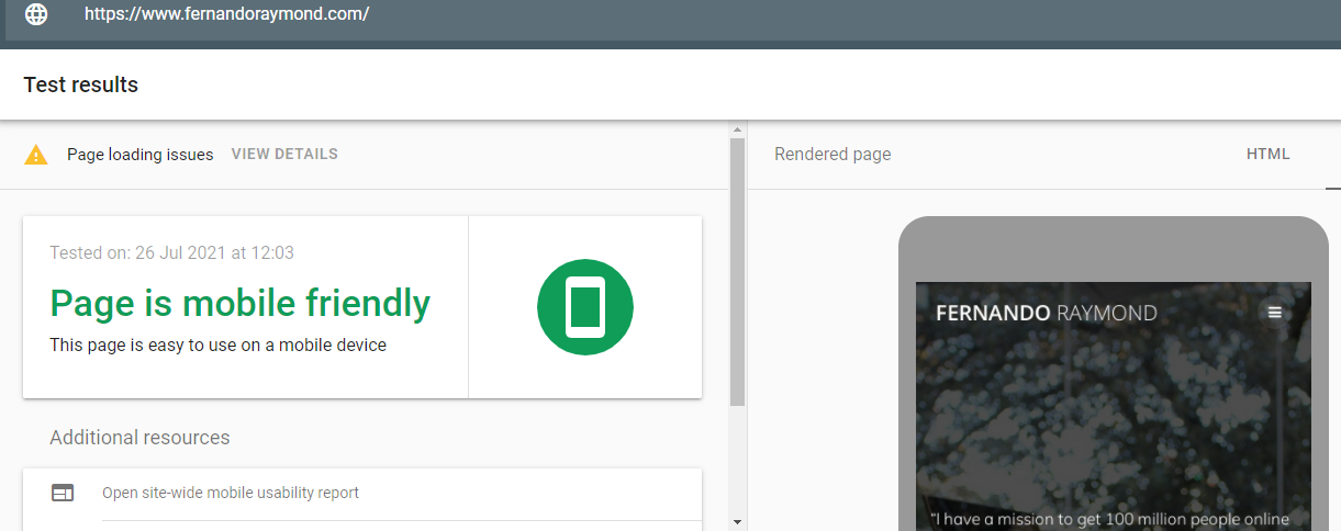
It is important to make your website is mobile-friendly and easy to navigate for all types of devices. Optimize your website and make it mobile-friendly to improve the user’s experience. If you are not sure whether your website is mobile-friendly or not, make use of Google’s Mobile-Friendly test tool.
Final Words:
I hope the above tips will help you to revamp your website to be more user-friendly and improve the UX for your websites effectively.
Author Profile
- Jr. SEO Consultant, Blogger, & Content Specialist. Passion for writing in SEO, Digital Marketing & Tech-related Niches.
Latest entries
 Link BuildingNovember 3, 2021Local Link Building Tactics for your Business
  Content MarketingOctober 26, 2021Top 8 Benefits of Content Marketing
 Social MediaOctober 23, 20215 Reasons Why you Need a Social Media Manager
 Content MarketingOctober 21, 2021How to Create a Winning Blog Content Strategy?


