How to create Perfect Contact Us Page for your website?

This blog is about creating a “Contact Us” page for the website and knowing the importance of the contact page. Having a well-designed contact, us page is the reason for the website to place on the first page in SERP ranking. Contact us page is more important for the website to track the client’s request and details. The right structured contact form embedded with the maps and images gives more response, also improves the overall SEO of your site.
There are more ways to design your contact page to get interact with the customers. Some websites directly get the customer’s details by filling the contact forms and other sites have call to action button, so they arrange a call back to their visitors from customer support or sales team. Contact form embedded with map will direct the people to their business place.
Creating a contact page is depends on your business type, so the contact form that works for others will not suit you, you should purely be customized for your own based on your business style and needs.
What are the main elements of the Contact Us form?
If you are creating a contact page for the first time, you may have many questions like what are the essential elements to make your contact us page more attractive and informative.
Just think about what you are looking for when you visit some other business contact page and list it all in your contact form. Having both a contact number and email address is best for effective communication. A well-designed contact page should have
- Your company name
- Your company address
- Your company contact number
- Your company email
- Your map location.
Check out some examples of contact forms.
Before we showcase you an example of great contact pages, we explain how a perfect contact page should look. Here are some key points for the contact us page.
Keep these key points in your mind while creating a contact page for you.
Make your contact page clear without any sidebars
Sometimes having sidebars or other details on your contact page makes distractions to your customers.
Limit the fields
Always build the contact us page with the limited and required fields. Sometimes fields on the contact page asking for more personal details suffers the conversion rate.
Contact page design should resemble your brand
Creating a contact page is for your brand growth. So, build it professionally by using the rich theme and make it more impressive
Keep write to our field.
Keeping a write us field helps your clients to write feedback or quires to share their expectations and experience with you.
what to mention in the contact pages is up to you, and the nature of your business. Instead of using the contact us, you can also use
- write to us
- Drop you details
- Let’s connect with us
- Talk to our customer support
- Reach us
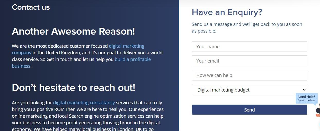
Now you get clear with the “contact us” page. Let’s check “how the perfect contact us page should look ?”
The above image is an example of the best “Contact Us” page.
How to create a “Contact Us” page for your website?
As you have seen in an example, all businesses should have perfect contact pages for their brand identification. Keep some of the contacts on our pages as your reference and design a unique contact us page for your brand website. Here are some of the hacks to create a contact us page in simple ways that helps to converts your website visitors into your customers.
Make your “Contact Us” Page Visible
Keep your contact us page visible to the website users and place the contact us page in the main menu. The main goal of creating a contact us page is to make the users get connected with you, so make sure the page should be easy access to them. If you don’t make your contact us page visible, then nearly 50 percent of people leave your site if they can’t get the contact information.
Use call to Action Button
Instead of using the same call to action button, use some catchy and unique words or phrases for the CTA button. Instead of using the same submit button, you can use Get In Touch as CTA. Click here also another phrase you can use as a CTA to increase the conversion rate.
Alignment
Our human brain gives more attention to the left side columns in a website. So, keep your contact page as left-aligned to get more attention from the users. The labels aligned from left to right look natural and bring more attention.
Add Thank you Pop-ups
Thank you and welcoming messages makes your user feel more special. Use a redirect option to the Thank your page after the submission of contact details. This helps to easily track how many users submit the contact form.
Test your Contact Us page
After creating a “contact us” page, test the page by filling in your contact details and check all the fields are work better. Also, check after giving the submission all the details are get collected in your backend in the right format. This is more necessary, the main aim of creating the contact us page is to get the visitor’s details. Make sure the page is working fine. Also compare with the style of other competitors and make your contact us page more attractive than others.
The main advantage of having a contact form rather than your email address on the site prevents spam emails and you can directly connect with your visitors.
Contact form for WordPress Website Step-by-Step
You can easily create the contact us page on a WordPress website by using a widget option.
Step 1: Choose the best contact form plugin
In the first step, you need to choose the WordPress plugin for adding a contact form. There are several free WordPress plugins available to create a contact form. Our choice is
- WPForms
- Contact Form 7
Now you are clear with contact form plugins, then let’s move to install the plugins. Here we show how to add a contact form by using both plugins.
Step 2: Installing a Plugin
Here we use both the plugin to show you how to create a contact form for the WordPress site.
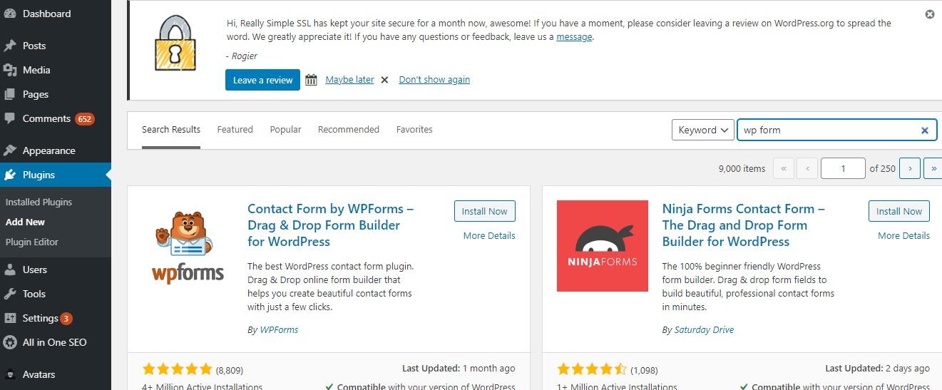
Log in to your WordPress website and go to the Plugins menu in your dashboard and give Plugins >> Add New
In the search option, type WP Forms and Install the plugin to your WordPress site.
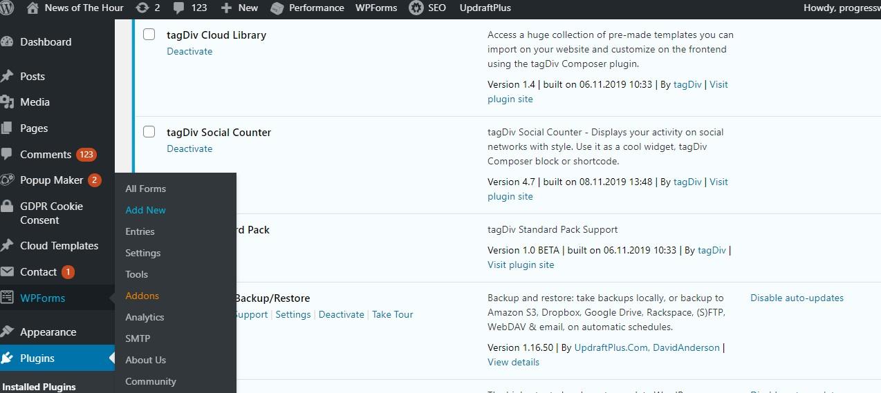
After installing activate the plugin in WPForms to create a contact page
Step 3: Creating a Contact Form Using WPForm
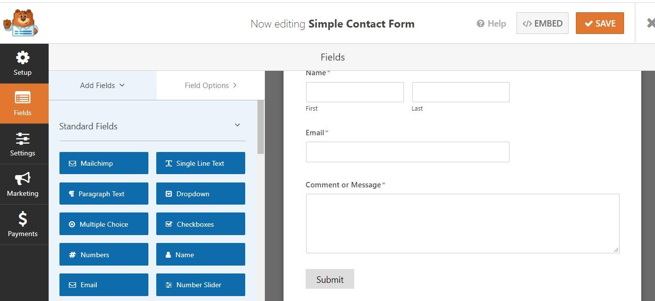
Now check the WPforms menu in your WordPress dashboard and click add new WPform >> Add new
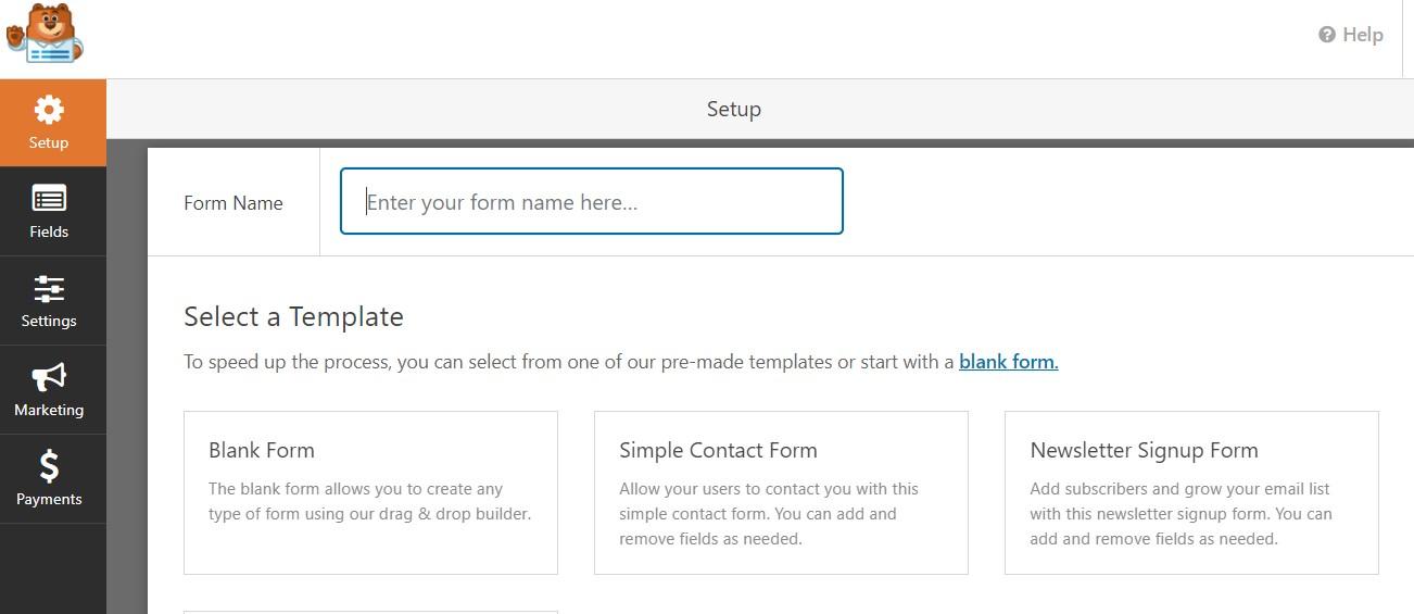
Now you can see the Adding a contact form option as shown in the below image
After Giving a form name in the Feild, you have option to choose the templates for the contact form, Here you can choose any one
Here we choose a simple contact form Template, After filling in all the necessary details and click the save button to save the WP contact form.
Step 4: Add WP form to your menu
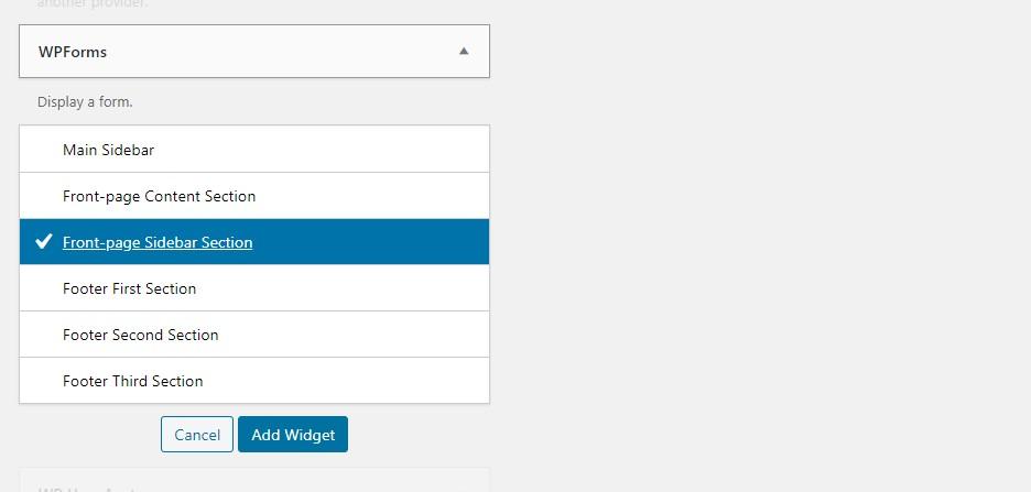
To display the WP form which you have created on your website go to appearance >> widgets you can drag the contact form to the WP theme.
Step 5: Display the contact us page
Click Add Widget to display the contact form to your website.
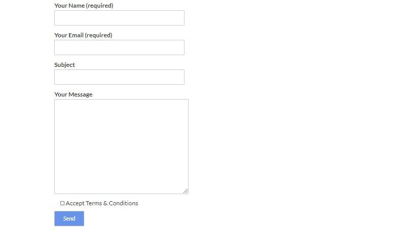 The procedure is the same for the contact form 7 plugin.
Hope this guide helped you to create a contact form on your WordPress site.
Author Profile
- Jr. SEO Consultant, Blogger, & Content Specialist. Passion for writing in SEO, Digital Marketing & Tech-related Niches.
Latest entries
 Link BuildingNovember 3, 2021Local Link Building Tactics for your Business
  Content MarketingOctober 26, 2021Top 8 Benefits of Content Marketing
 Social MediaOctober 23, 20215 Reasons Why you Need a Social Media Manager
 Content MarketingOctober 21, 2021How to Create a Winning Blog Content Strategy?


