7 Mobile Usability Tips for Online Platforms to Boost Brand Trust
When using online platforms, mobile usability and brand trust are crucial.
If users find your platform difficult to use on their phones, they might leave and not return.
Let’s delve deeper into ways to improve mobile usability and boost brand trust for better conversions.
Table of Contents
1. Make Navigation Easy

Users should be able to find what they are looking for in no time. Navigation needs to be simple and clear. Make sure your menus are easily accessible and that options are labelled in a way that anyone can understand. If you have important sections like “Home,” “Profile,” “Settings,” or “Contact,” make them visible and easy to tap. Try to avoid complicated menu structures and, instead, keep things straightforward.
A good example is the bet365 app, which is popular because it is simple, efficient, and builds trust by being user-friendly. The app allows users to easily jump between sports betting options, casino games, or account settings, which makes it efficient and stress-free.
2. Responsive Design is Key
A responsive and aesthetic design ensures your platform works well across different devices. Your site or app should adjust to screen sizes, whether a person is using a smartphone, a tablet, or a desktop computer. This means images, text, and buttons should resize and align correctly.
It’s also important for features to work well no matter the device. If your app only looks good on one type of phone but breaks on another, users may lose trust. Consistency across devices helps people feel that your platform is professional and reliable.
3. Fast Load Times Matter
No one likes to wait for a slow app or website. Speed is very important. Users expect pages and features to load in just a few seconds. To make this happen, optimize your images and videos so they don’t slow down your site. Limit the use of heavy animations or large files. For example, if you use images, compress them without losing too much quality. A platform that takes too long to load can feel untrustworthy, and you risk users leaving before even engaging with your content. The faster your platform loads, the more people will enjoy using it.
4. Use Simple Forms

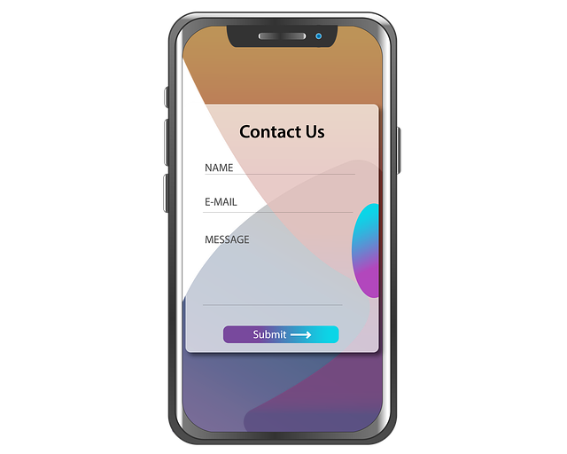
Forms are a common part of many apps and websites, whether for signing up, logging in, or making a purchase. Keep your forms as simple as possible. If you ask for too much information, users may abandon them. Focus on only the essential fields. For example, a sign-up form should only ask for a name, email, and password. If possible, use features like autofill to make it easier for people to complete the form. Additionally, make sure the input fields are big enough for users to type comfortably on a mobile device.
5. Clear Error Messages
Errors are inevitable, but how you handle them can make or break the user experience. Provide clear and direct error messages when something goes wrong. For instance, if a user enters an incorrect email, don’t just say “Error.” Instead, give a helpful message like, “Please enter a valid email address.” Also, consider highlighting where the error occurred so users can easily correct it. Avoid using confusing or technical language. Make it a goal for the user to understand what went wrong and how to fix it right away.
6. Focus on Security
People will only use your app or platform if they feel safe. To build trust, make security a top priority. This includes using HTTPS to encrypt data, offering secure payment methods, and being transparent about how you handle user information. Display security badges and mention the measures you take to protect user data. For example, the bet365 app emphasizes its security features, like strong encryption and verified payment methods, to assure users that their information is safe. A strong sense of security can greatly improve how much people trust your brand.
7. Gather User Feedback

Your users are your best resource for finding out what works and what doesn’t. Make it easy for them to share feedback. This could be through a simple rating system, a short survey, or a feedback form within the app. Pay attention to complaints and use them to improve your platform. When users see that their opinions matter and that you’re taking steps to make things better, it builds trust. It also shows that you care about the experience you are providing.
Conclusion
Improving mobile usability and building brand trust are connected. Keep your design simple, responsive, and user-friendly. Make your platform secure and transparent about how you protect user data. Platforms like the bet365 app are successful because they put these principles into action. By focusing on what makes an app easy and safe to use, you’ll attract and keep more users.
Author Profile
- Online Media & PR Strategist
- Blogger and Educator by Passion | Contributor to many Business Blogs in the United Kingdom | Fascinated to Write Blogs in News & Education I have completed a journalism summer course at the London School of Journalism and am an eBook author.
Latest entries
 EmploymentFebruary 6, 2025How Do Accurate Testing Solutions Help Create Safer Work Environments in the UK: An Expert Analysis
 Online BrandingNovember 27, 2024Global vs. Local Websites: Which is Best for Business?
 TechnologyNovember 6, 20247 Mobile Usability Tips for Online Platforms to Boost Brand Trust
 Home BusinessSeptember 25, 2024Top 8 Home Office Essentials for a Seamless Work from Home Experience

