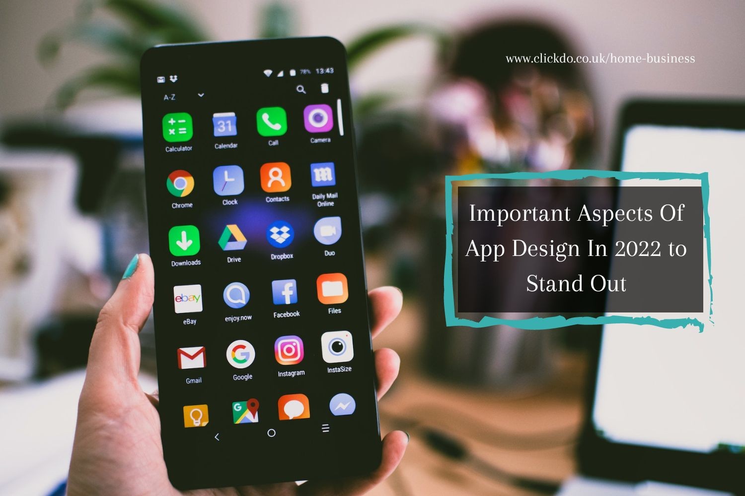
7 Important Aspects Of App Design In 2022 to Stand Out
In today’s world, when everything is digitalized, and when there is an app for everything, it is important to know how to make yours stand out.
There are numerous details that you need to pay attention to, details that the users will notice as well. When done badly, app design and development can be something that can turn away customers. But, when done right, app design can attract millions of users.
Of course, people’s preferences change with time, and it is not the same thing that is always trendy. This is exactly why it is important to always follow the market and know which visual styles are popular.
If you are looking into designing an app in 2021, you have come to the right place. In this article, you will find various aspects of app design that are important and popular this year.
Table of Contents
1. Simplicity
 When the digital era started, a lot of people used complex, colourful designs that would not be the most popular today. As the years passed, the market started focusing more on simplicity than on clutter. In 2021, designers are aiming to make the designs fit the market’s demands. Therefore, the buttons and icons have become a lot more simplistic compared to a few years ago.
Of course, this trend did not come from anywhere, users are the ones defining it. So, it is important to find a flutter app development company that will give you a user-oriented design. When you follow what the market demands, you will surely be able to attract more users.
2. The Swiping Experience
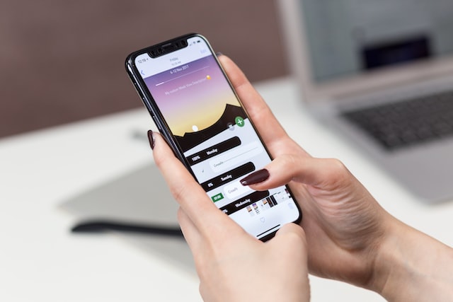 In 2021., it is not enough for an app to look good, it also has to be engaging. Of course, the classic clocking is easy and quick, a swiping option makes an app a lot more fun. So, take advantage of this interesting feature. It can even attract people to use the app more just because it is fun! Of course, there are a variety of approaches you can take. The thing to keep in mind is not to overdo it. Even though your app should be fun and attractive, putting too many swiping options might make it look like more of a game. So, to make sure your app is professional-looking, keep the swiping in moderation.
3. Clarity
 All of us understand that in order for an app to be useful, it needs to be relevant to what it is used for. The thing is, being relevant is not enough for an app to be successful – it needs to be clear and easy to use. For instance – if the function that the user is looking for is buried under a sea of options, it won’t be easy to use. You need to make all the functions very clear and easily accessible. This will ensure that people find what they need with ease, which further enhances the efficiency of the app in question.
4. A Design that is easy on the Eyes
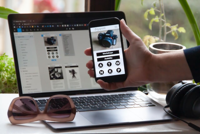 Apart from being beautiful, an app or web design should also be easy on the eyes. That way, it will not only allow the user to go through it easily, but it will also allow them to enjoy using it. Most people spend a lot of their time on their phones every day, so it is important to make your app a comfortable viewing experience. So, make sure you create easily comprehensive designs. Pair these with soothing colours and illustrations that are easy on the eyes. This means using natural colours and simple layouts that are comfortable to look at.
Many people tend to overlook how even the simplest aspects of your app affect user-friendliness. The colour of the layout has been mentioned, but let’s go a bit more into the detail. Basically, colours affect the way in which we perceive different things more heavily than you can imagine. Some colour categories such as pastels are just softer for the eyes and can induce a sense of ease and happiness.
So, be careful about your colour choices – instead of trying just to snatch your user’s attention, make sure that they enjoy the time spent on your app as well. This is especially important because your app is an important factor in how your business is perceived.
5. Compatibility
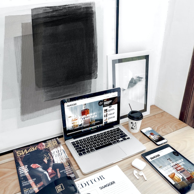 Did you ever run into an app that, from the moment that you’ve started using it, makes it clear that it was made for a different platform? Well, it is frustrating, as it makes it harder for the user to enjoy using it by decreasing efficiency. No matter what the majority of your demographics use to access your app – take the time to optimize the app development for every platform or utilize one of the top software companies to help. This will ensure that everyone truly enjoys the app in question, no matter whether they use an android device, apple, or even something else entirely.
6. Abstract styles
 Even though many apps are using dimensional effects and realism, a lot of brands prefer more abstract styles. A design like that looks a lot more artistic and modern. It draws people’s attention with its simple abstract shapes and bright colours, without distracting them from the functionality of the app. An abstract and artistic app design has a delicate balance between simplicity and intricate detail. And yet, it allows you so much design freedom.
7. Shadows and layering
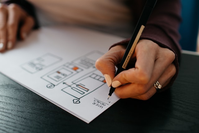 When you cannot make a graphic pop out of a screen, you can push everything else back. The easiest way to do this is through layering and shadows. Of course, you should only do this if you want a bold design since these techniques are not about subtlety.
But, if you want to achieve visual depth, add strong shadows and contrast to both your graphics and photos. The other approach you can take is to layer your elements, with some parts overlapping others. This way, your design will have an internal hierarchy.
In the end, it is important for you to understand just how much the app design impacts the way in which your app is perceived. As consumers, it is easy to overlook how intricate details affect our overall user experience. The thing is, that exact elusiveness is the end goal when it comes to designing the website and app layout. Giving a purpose to each and every element in the app that you make can oftentimes seem like a lengthy and unnecessary endeavour. The truth is, giving a lot of thought to these elements is what makes the difference between a top-class app, and one that doesn’t stand out of the crowd.
By reading this article, you have been able to learn more about how different aspects affect both the interface and how easily people navigate through your app. Be mindful of all these aspects, and continue doing your research in order to perfect your app even as a student. Good luck!
Author Profile
- Online Media & PR Strategist
- Blogger and Educator by Passion | Contributor to many Business Blogs in the United Kingdom | Fascinated to Write Blogs in News & Education I have completed a journalism summer course at the London School of Journalism and am an eBook author.
Latest entries
 EmploymentFebruary 6, 2025How Do Accurate Testing Solutions Help Create Safer Work Environments in the UK: An Expert Analysis
 Online BrandingNovember 27, 2024Global vs. Local Websites: Which is Best for Business?
 TechnologyNovember 6, 20247 Mobile Usability Tips for Online Platforms to Boost Brand Trust
 Home BusinessSeptember 25, 2024Top 8 Home Office Essentials for a Seamless Work from Home Experience

